photographer | designer | visionary
Heidy + Co
I’m Heidy, and I bring the drama
(to your visuals, not your inbox).
For lovers of color and storytellers with a vision, I’m a designer who brings bold ideas to life through vibrant, multimedia-driven design. I specialize in creating visually compelling, personalized branding that captivates, connects, and pushes boundaries.
Dear Reader,
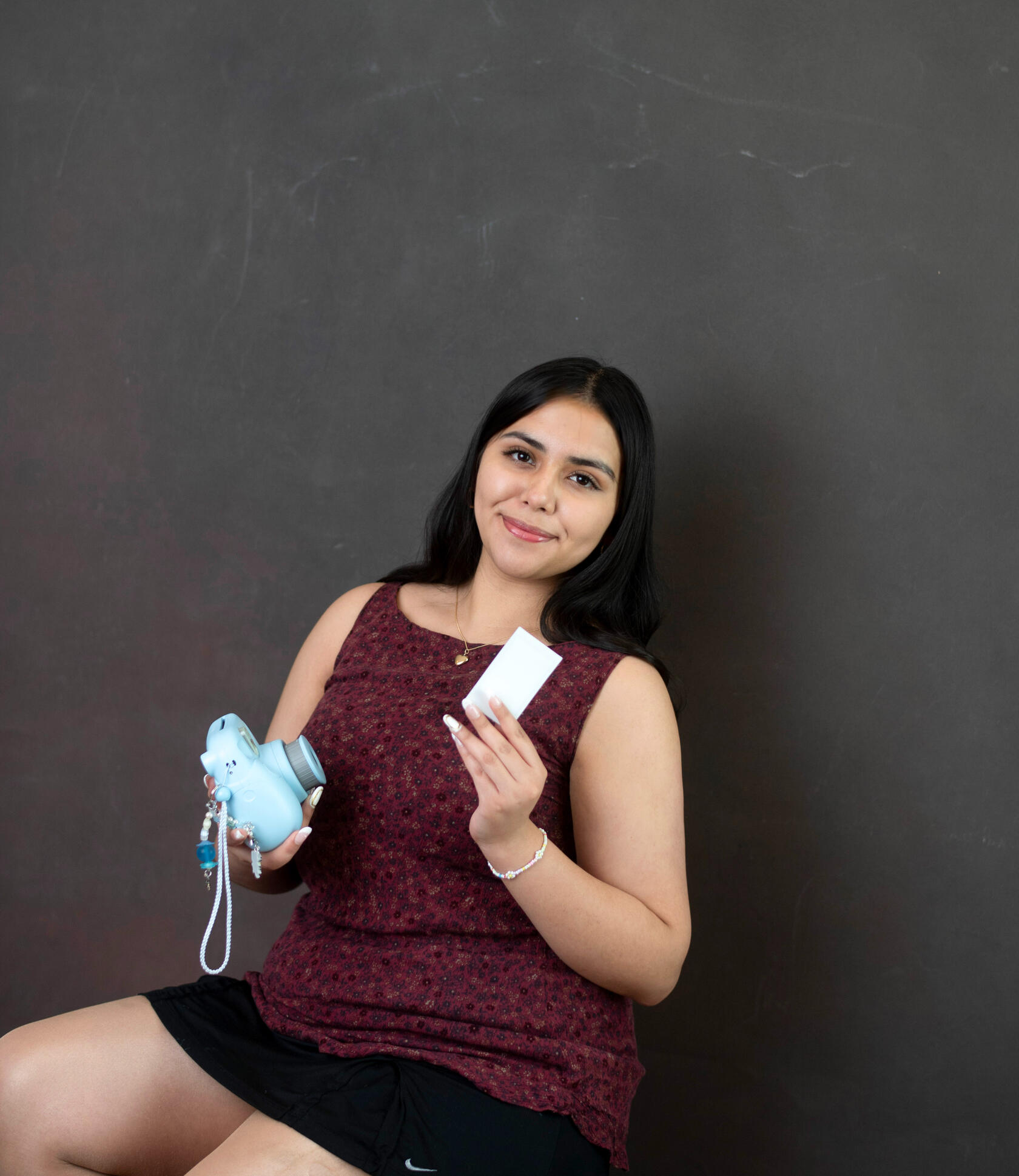
Hey, I’m Heidy — a designer, photographer, and color enthusiast who believes that good design should make you feel something.
I help brands, creatives, and storytellers bring their visions to life through vibrant, personalized design that blends strategy, emotion, and innovation.With a strong focus on color, multimedia, and narrative, my work spans across digital and print platforms, from branding and visual identity to photography and interactive design. I believe in the power of visuals to communicate deeply, create connection, and make a lasting impact.My process is collaborative, thoughtful, and grounded in the idea that great design is both functional and expressive. Crafting tailored experiences that reflect the uniqueness of every client and audience.If you're looking for design that’s visually compelling, conceptually strong, and always a little unexpected, let’s connect.
Portfolio
Astralight
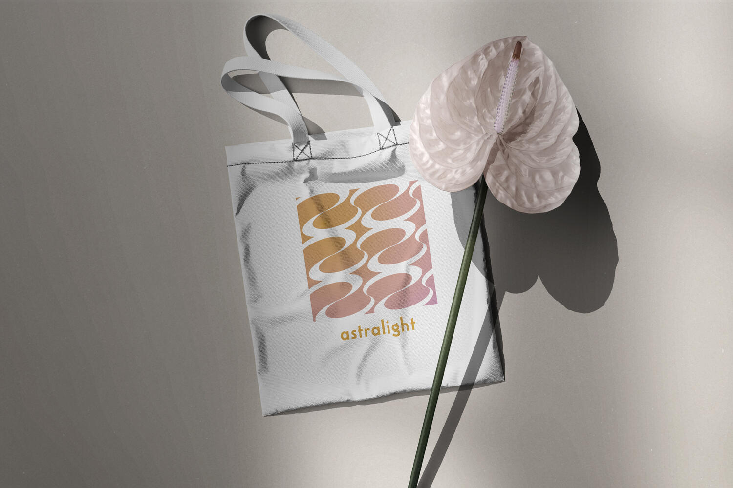
A festival for your eyes and ears.Tasked with branding a fictional music festival, I developed a full visual identity that extended across posters, merch, and a website. The challenge was to create a cohesive look that could live loud across both print and digital platforms. I focused on bold typography, rhythmic layouts, and vibrant color to reflect the energy of the event. The result? A unified brand system that amplifies the experience from first glance to final encore.


Doc Martens Campaign
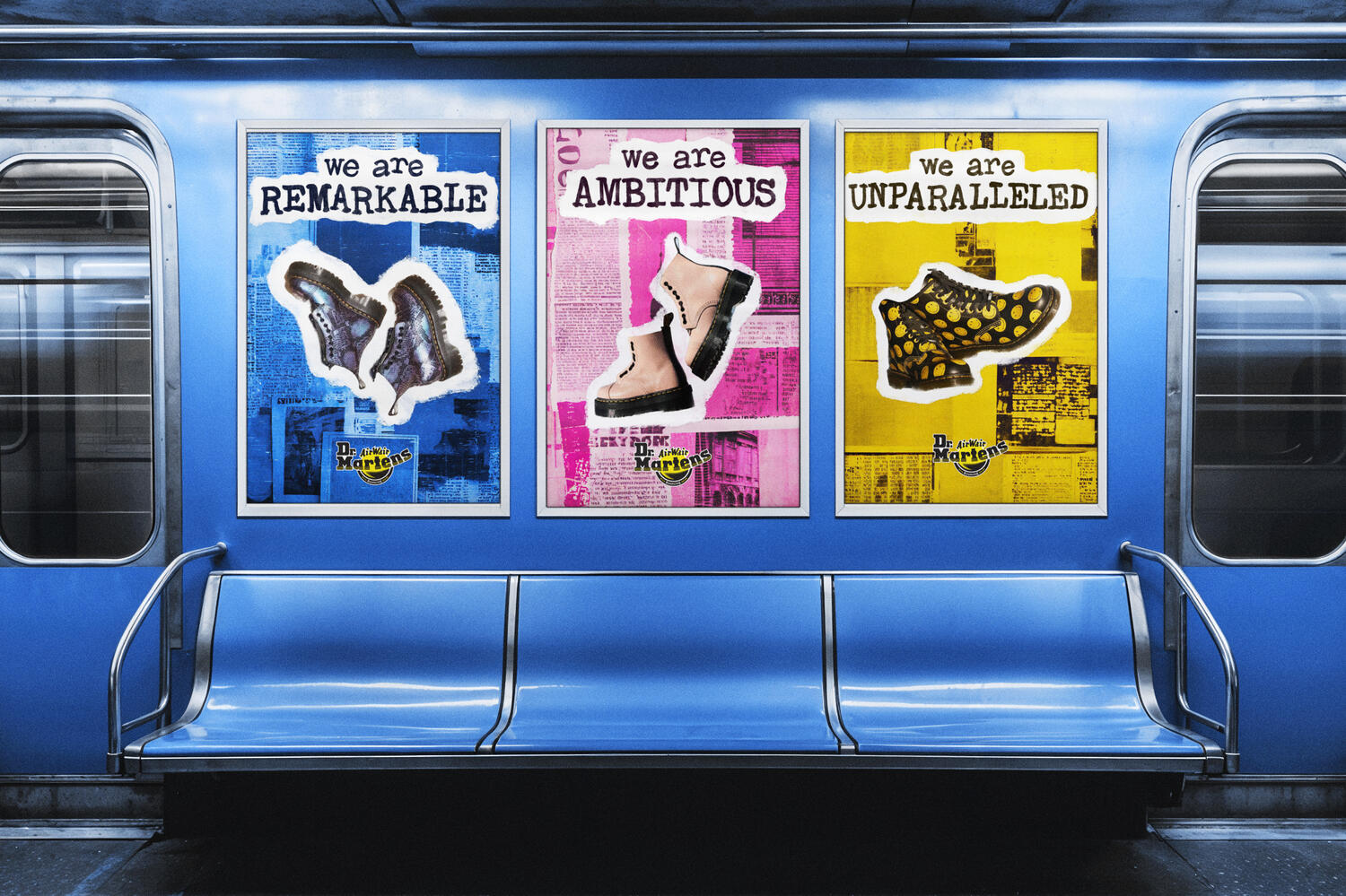
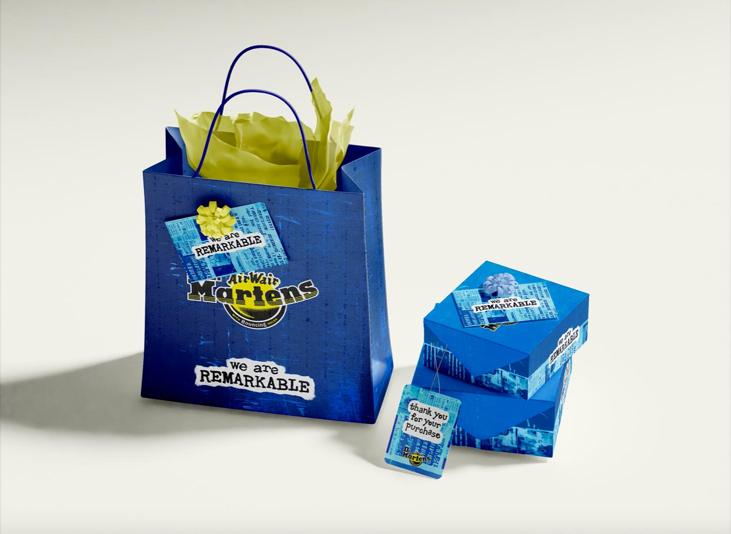
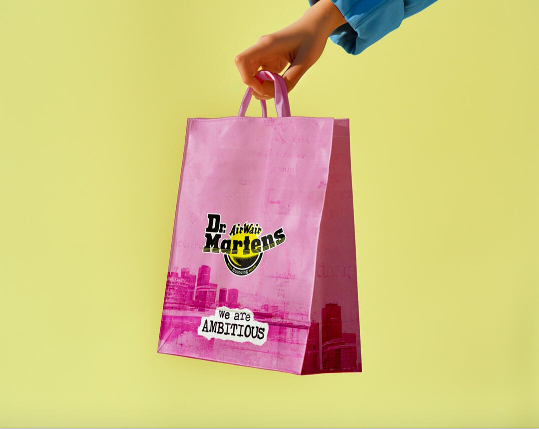
Doc Martens, redefined for the streets.In this semi-independent brief, I took on the role of an art director to expand Dr. Martens into a fresh, campaign-ready concept. The goal was to build not just visuals, but a full creative direction; enhancing ideation, Adobe skills, and campaign writing. I reimagined the brand through bold posters and product
mockups, merging gritty textures and rebellious typography to amplify their unapologetic identity. The result is a campaign that walks the line between heritage and modern edge.

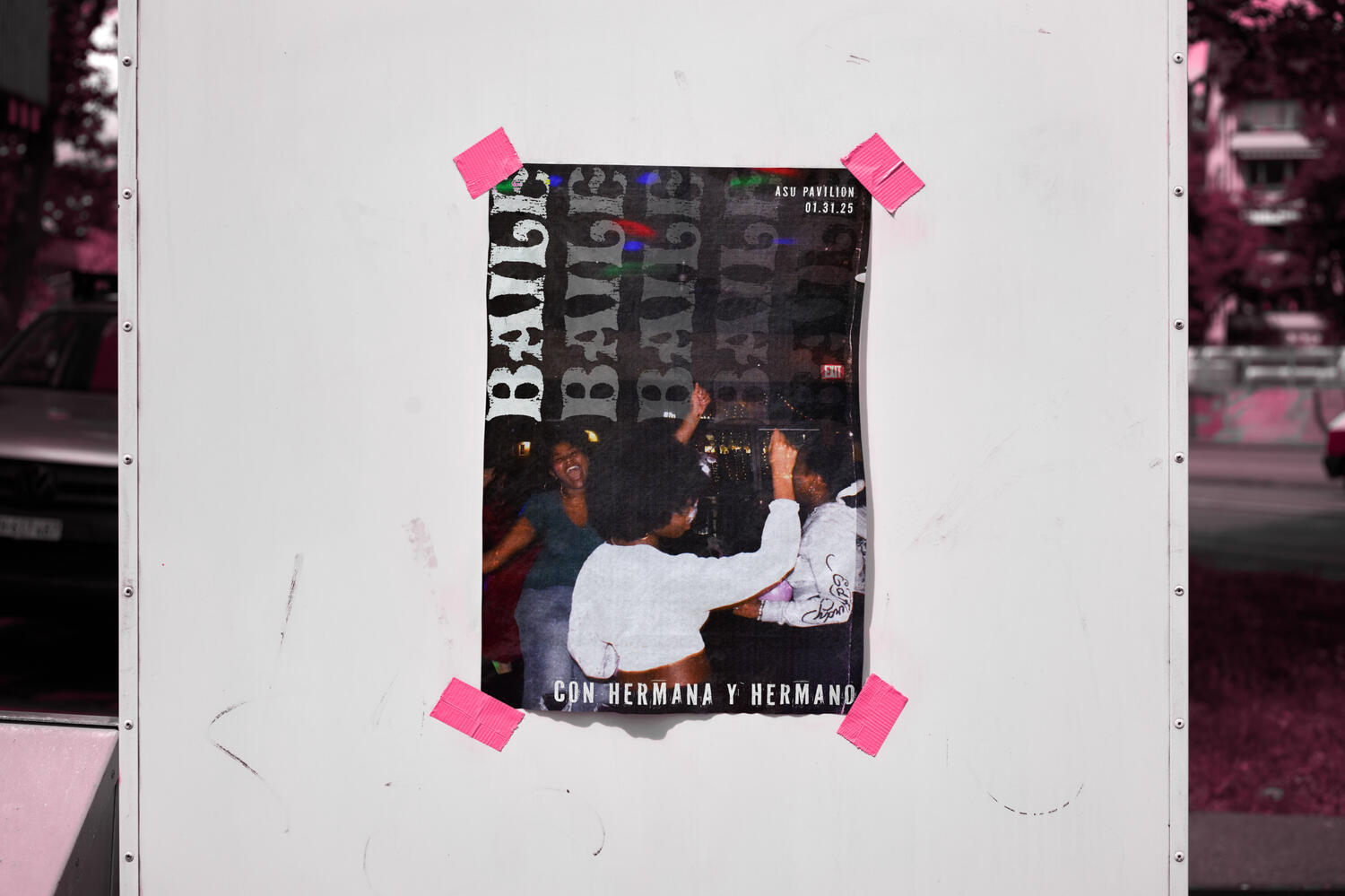
Baile with H&H
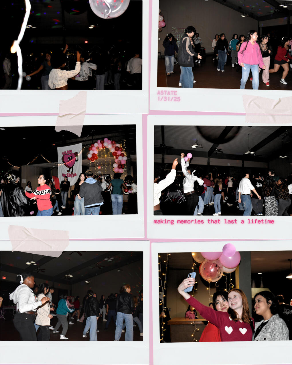
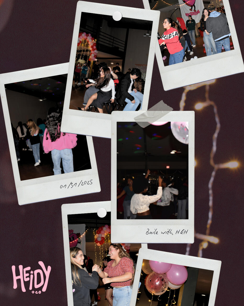
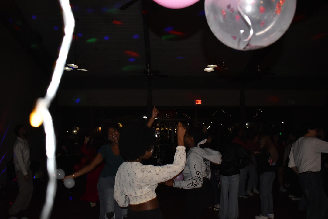
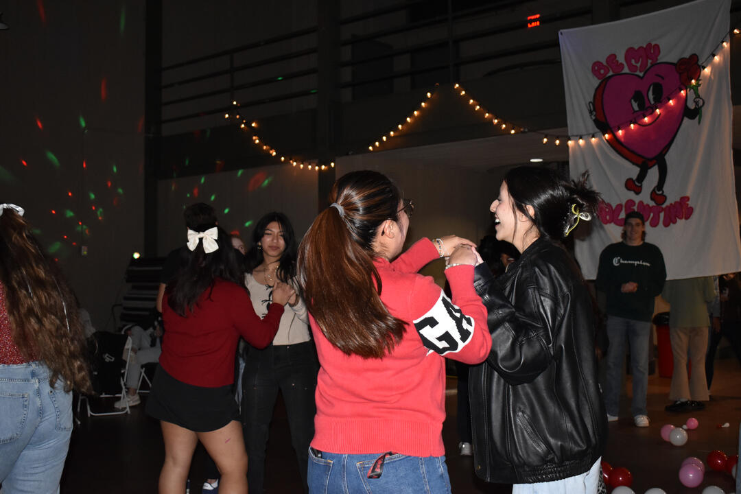
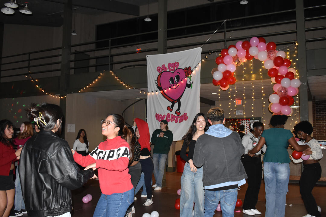
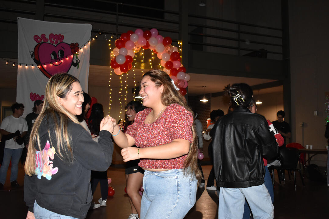
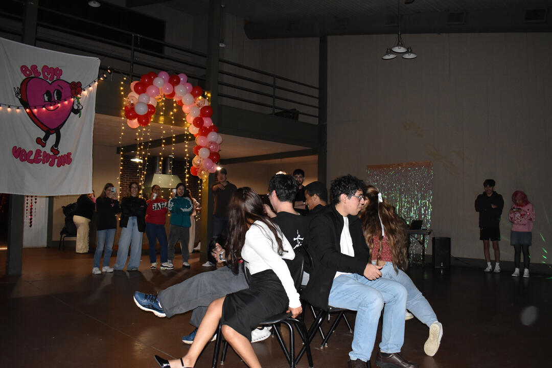
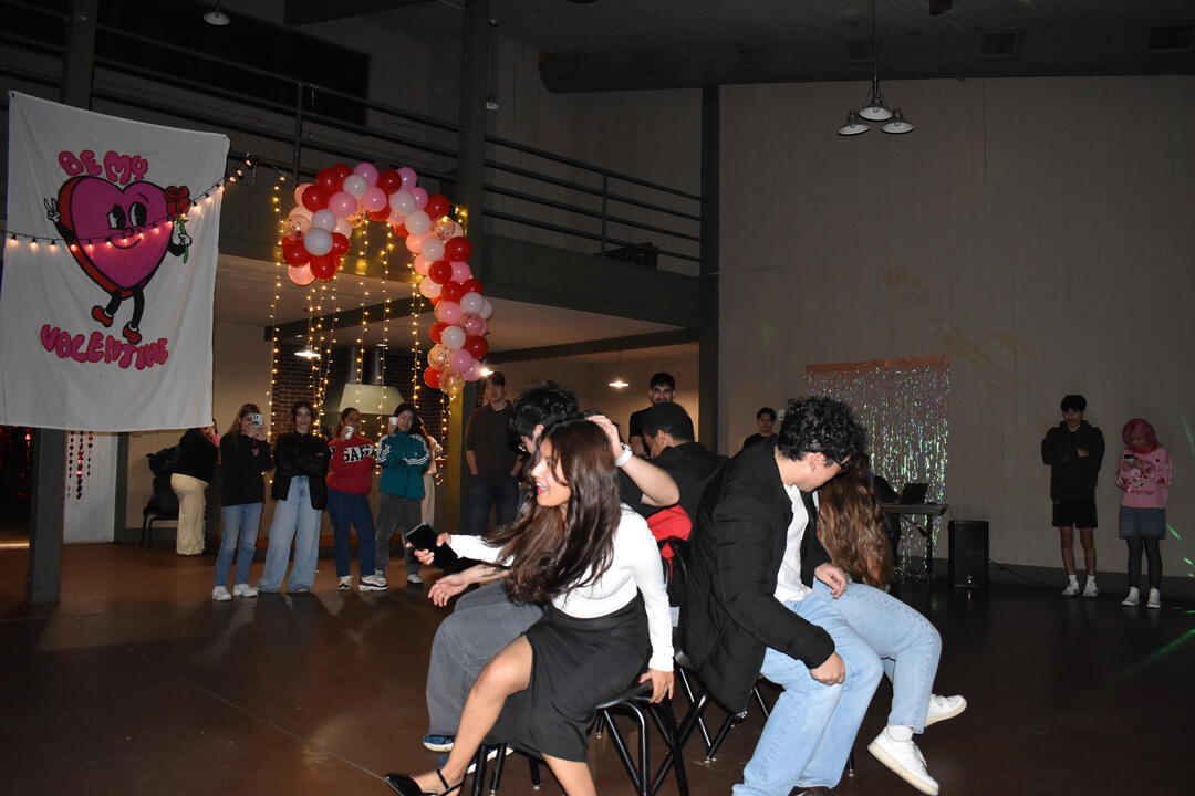
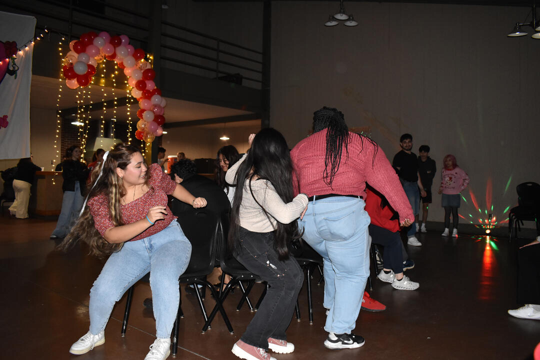
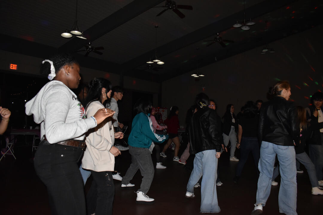
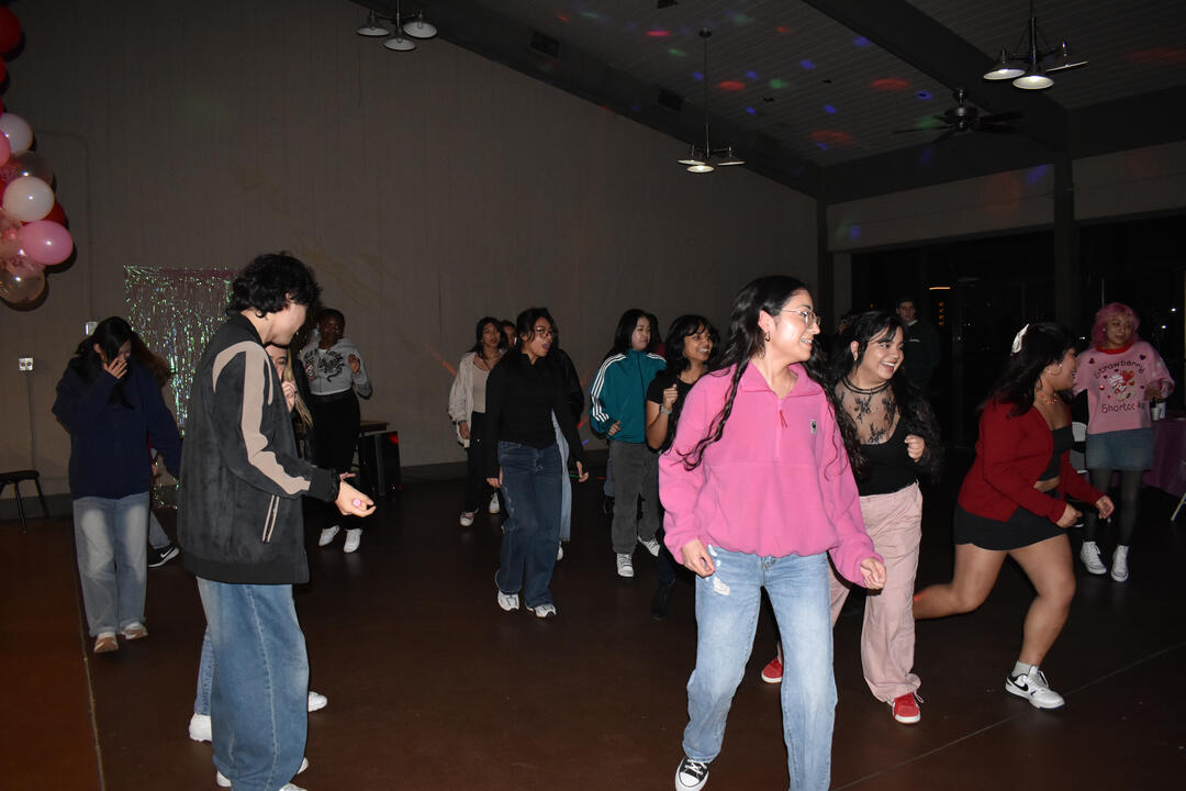
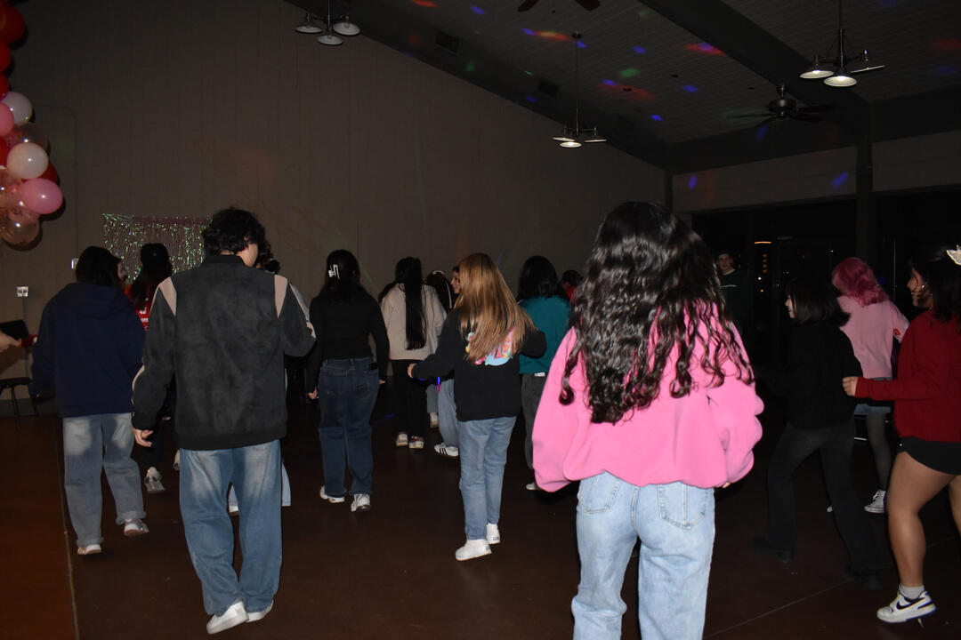
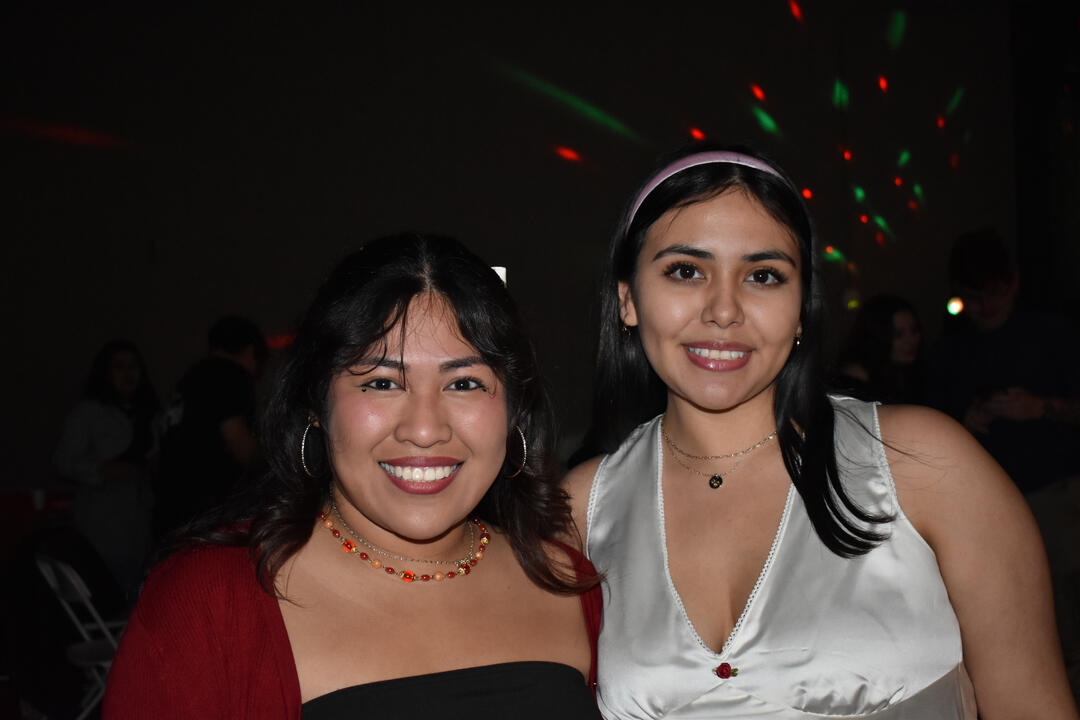
Baile with Hermana y Hermano: Recap PosterTo commemorate Baile with Hermana y Hermano, a cultural organization at Arkansas State University, I created a recap poster that visually preserves the energy of the event. The goal was to design something that felt authentic and celebratory. I photographed the event myself, capturing candid moments of movement, color, and connection. Using those images, I designed a poster that reflects the vibrant spirit of the night and honors the community at its heart. The final piece serves as both documentation and celebration.
social media posts
gallery
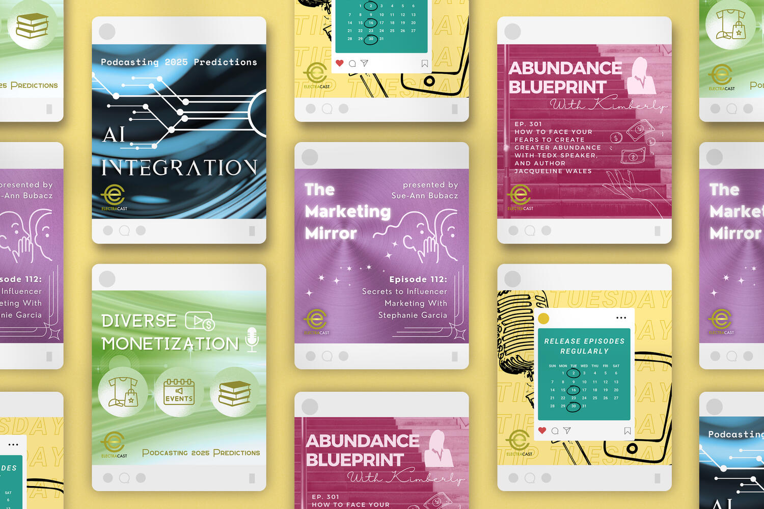
Electracast Media
During my graphic design internship with ElectraCast, I created a series of social media posts to help promote their podcast network and
new shows. The challenge was to design content that was visually engaging, on- brand, and adaptable across different platforms. Using bold typography, consistent branding elements, and dynamic layouts, I built a library of graphics that boosted visibility and audience engagement. Each post was crafted to match ElectraCast’s energetic, forward-thinking voice.

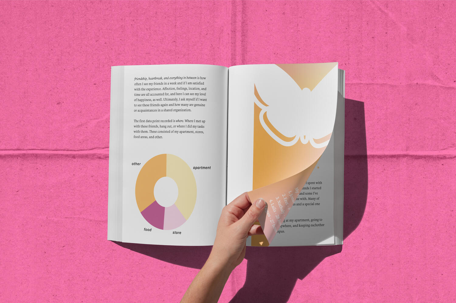
Friendship, Heartbreak, and Everything in Between
This data visualization project transformed my spring semester into a personal journal—told through design. I collected and represented emotional, social, and everyday data in a printed booklet that blends storytelling with structure. Using layout, color, and visual language, I mapped out the patterns of connection, distance, joy, and change over time. The result is a deeply reflective piece that lives between data and diary.
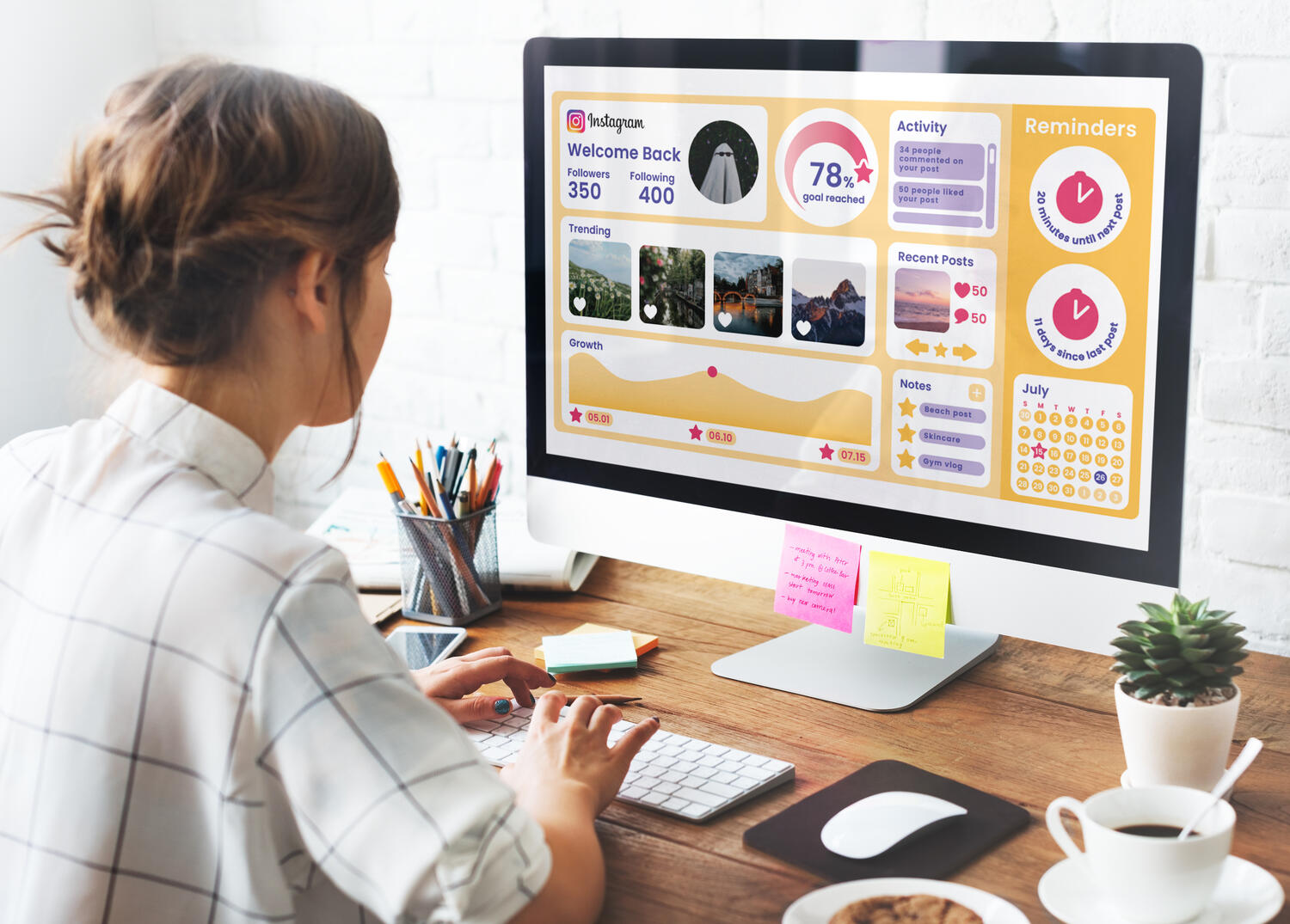
Social Media Dashboard
Scroll smarter, not harder.This Instagram-inspired dashboard was designed with user experience at its core. Built in Adobe XD, the project focused on clean typography, thoughtful composition, and intuitive navigation. The goal was to create a seamless interface that helps users track their content performance without the clutter. Every element—from layout to interaction—was crafted to enhance usability and make data feel approachable.
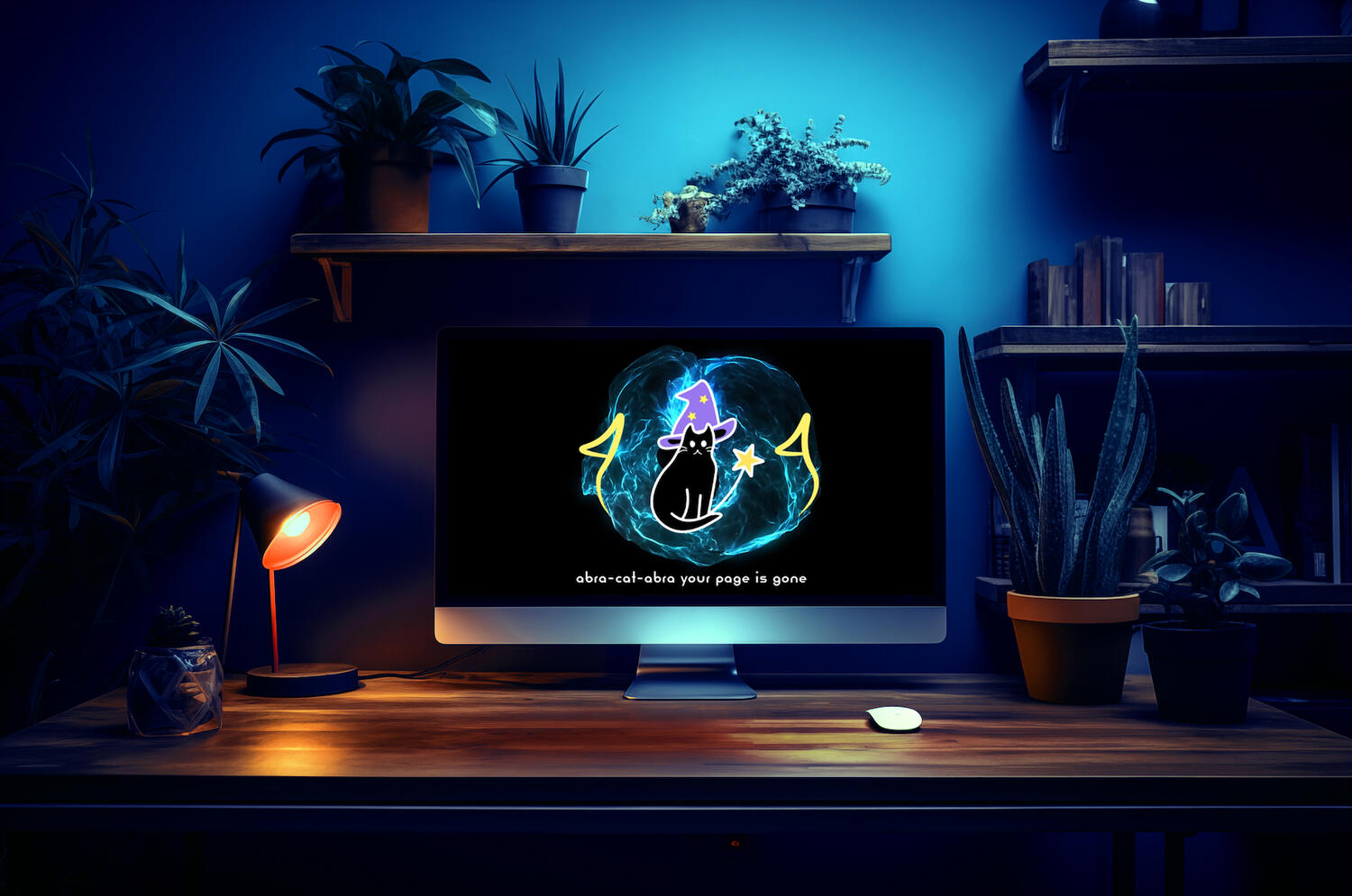
404 Page
Lost? A wizard cat will guide you.This 404 page design turns a frustrating moment into a fun one with the help of an animated wizard cat. Using scale, visual hierarchy, and a magical color palette, I created an experience that’s as delightful as it is functional. The goal was to keep users engaged even when something goes wrong—because even a dead end can have some charm (and a little sparkle).

Self Promo Poster
This self-promo poster was created to visually introduce who I am as a designer and storyteller. The challenge was to reflect my style, values, and creative voice in a single, eye- catching piece. Through bold typography, playful color, and thoughtful composition, I crafted a design that feels personal, confident, and approachable. The final poster captures not just what I do—but the energy and personality I bring to every project.
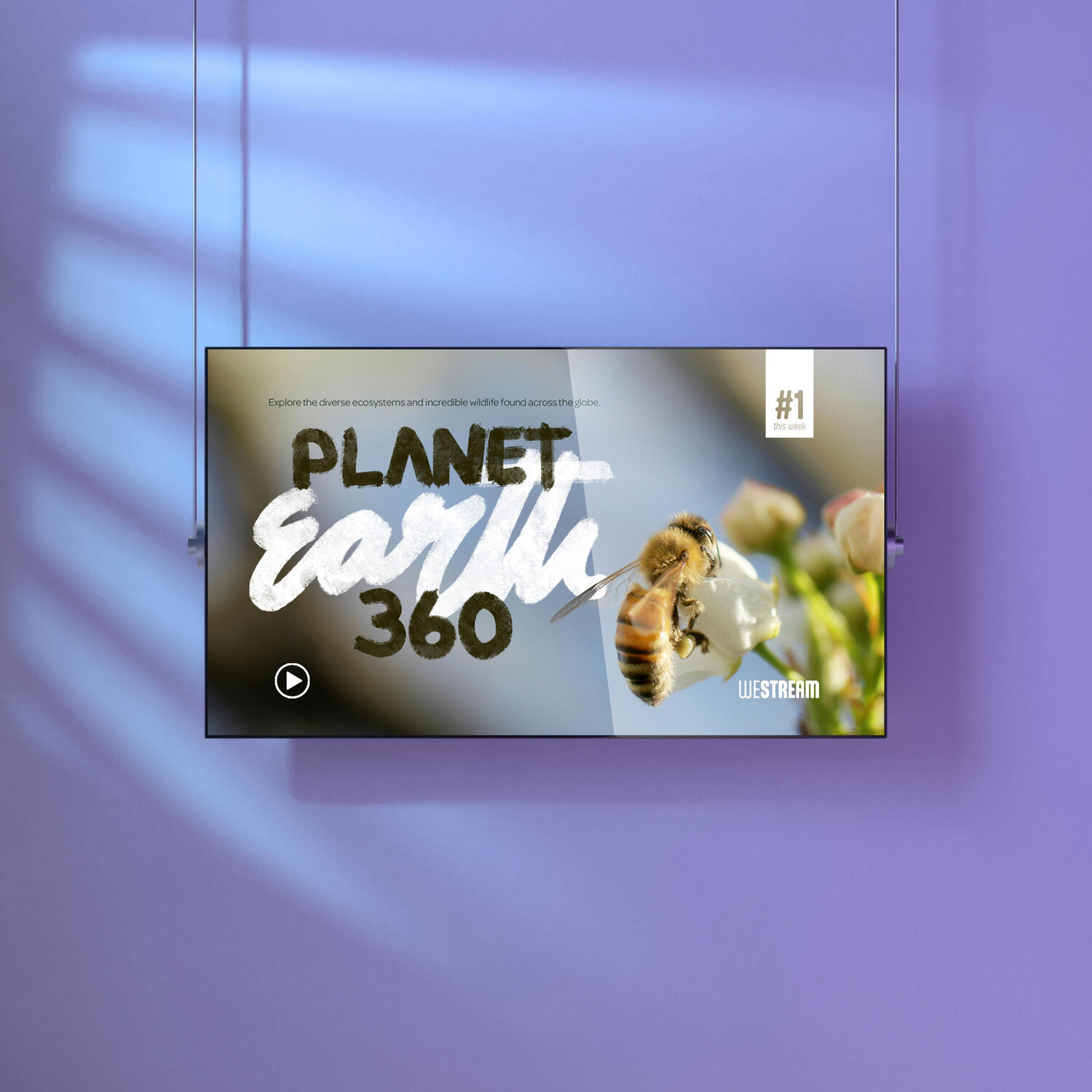
Planet Earth 360
I created a cinematic title card for the imagined Netflix documentary Planet Earth 360. The challenge was to capture the vastness and interconnectedness of the planet in a single visual moment. I used bold typography, atmospheric textures, and a global-inspired color palette to evoke a sense of wonder and urgency. The final design sets the tone for an immersive documentary experience, inviting viewers to explore the Earth from every angle.
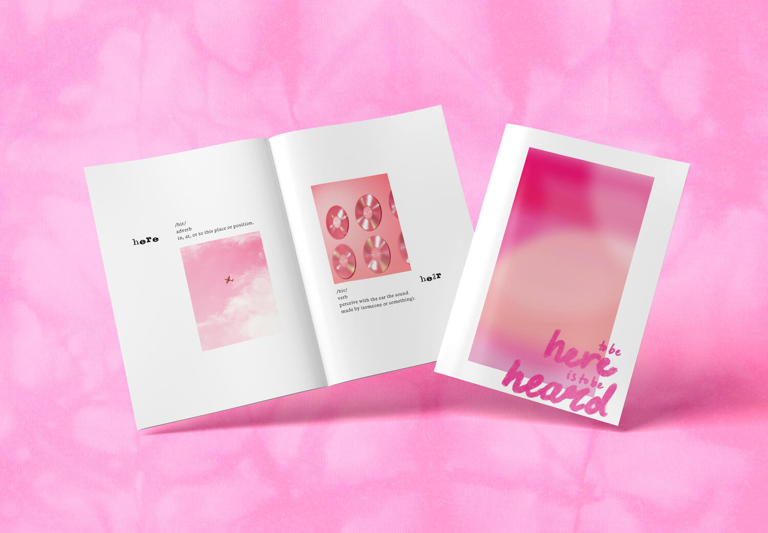
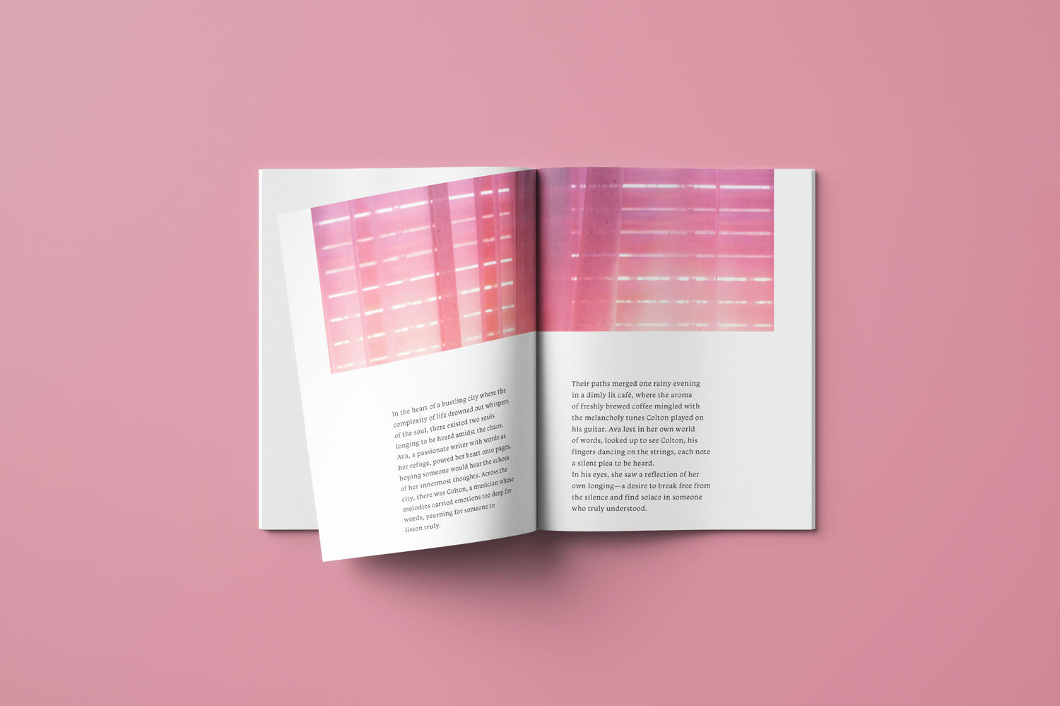
Heard Booklet
To Be Here Is To Be HeardThis booklet was created to amplify voices and experiences often overlooked. The challenge was to design a piece that felt both empowering and intimate.
I used thoughtful typography, personal storytelling, and a warm visual language to build a space where every story feels seen and valued. The title plays on the homophones here and heard, emphasizing both physical presence and the importance of listening. The final product is a booklet that invites readers to pause, reflect, and truly connect.
Design Research Poster
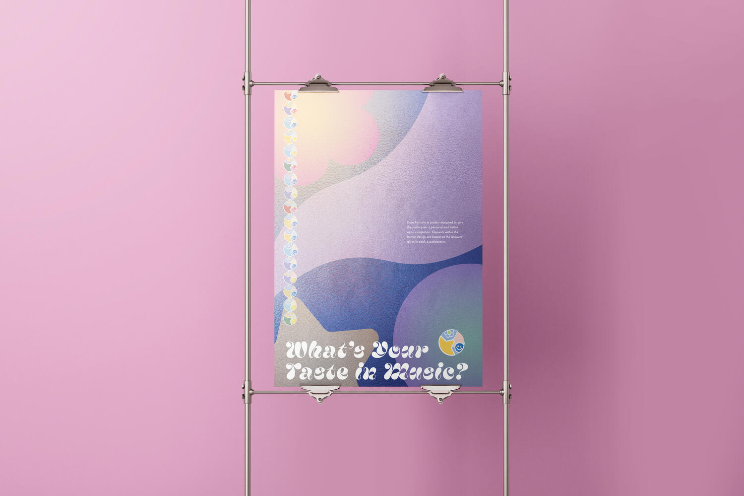
Music made visual.This poster promotes Data Portraits, an interactive project where participants receive a personalized button based on their music taste. Each design is generated from a questionnaire, translating individual preferences into visual elements like color, shape, and rhythm. I designed the poster to reflect the energy of the experience—dynamic, personal, and a little playful— while highlighting the blend of data, design, and identity.
Crimson Book
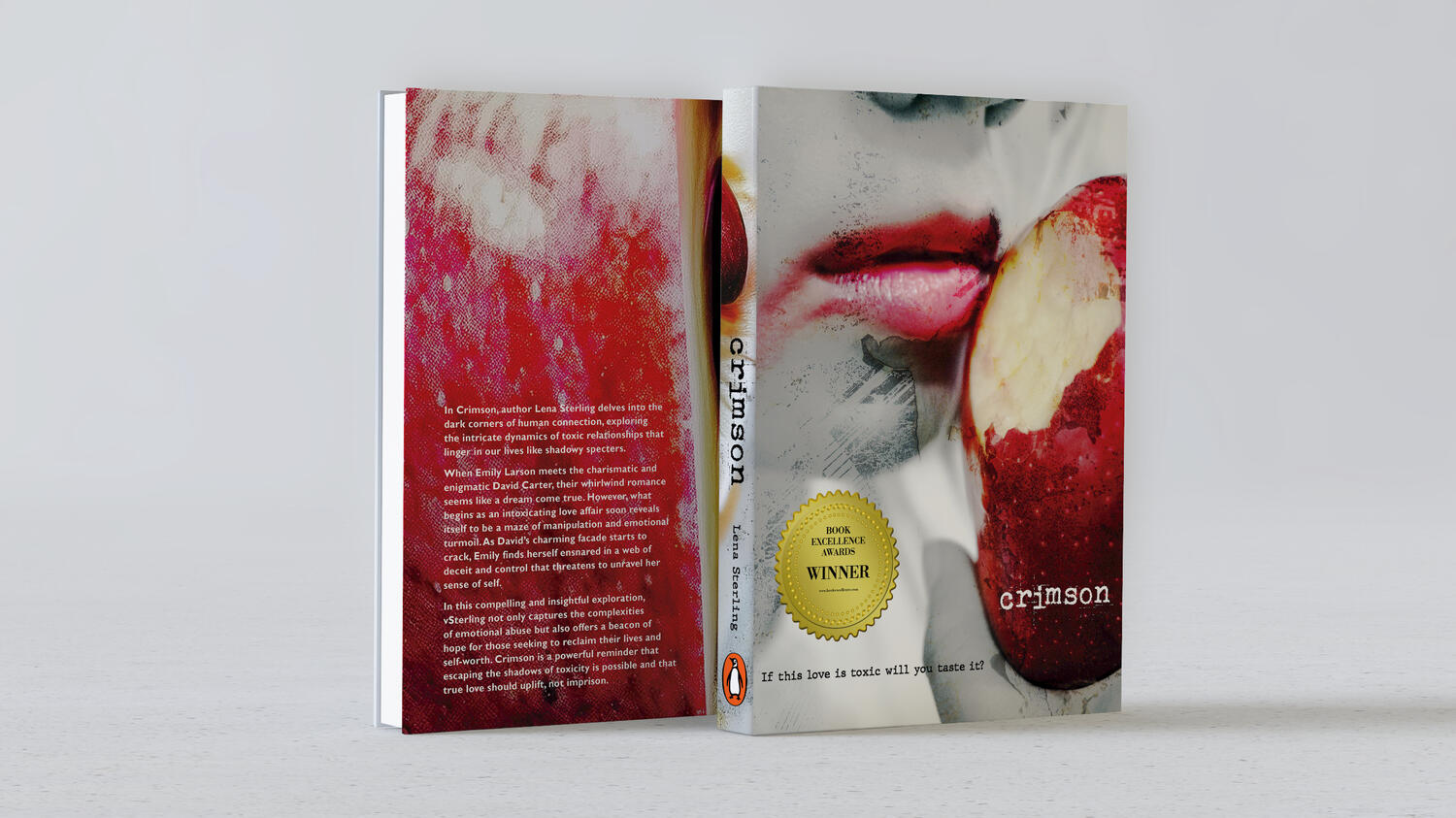
Crimson, through my lens.For this book cover design, I used original photography to reflect the raw emotion and intensity suggested by the title Crimson. The challenge was to translate a powerful narrative into a single striking image. I crafted a moody, cinematic composition using deep reds and sharp contrast to evoke tension and intrigue. Every visual choice, from lighting to typography, was designed to echo the story’s visceral tone and pull readers into its world at first glance.
Contact Me!
Email [email protected]


